Add custom (S)CSS
How to get there: Go to Settings → Custom code.
Matching the portal to your brand is vital for a seamless experience for your users.
You can determine several colors in Settings → Portal design → Branding by default, but what if you want more customization?
This is super easy and hyper-flexible in ProductLift using custom (S)CSS.
Start custom designing
-
Go to Settings → Portal design → Branding and expand Advanced
-
Open the Custom CSS editor
-
Enter your custom stylesheet and save
Here you can add CSS or change elements.
Variables
You can design your portal by overriding the default variables.
An example:
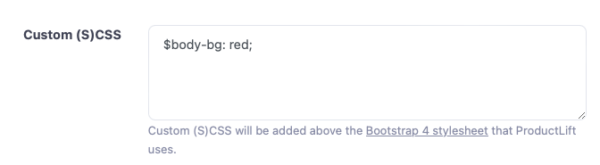
Here is a list of the most regularly used variables. You just set them in the (S)CSS box to override them with a new value.
ProductLift uses the Bootstrap 4 library, so you can override any of their variables.
Example setting the Montserrat font:
@import("https://fonts.googleapis.com/css2?family=Montserrat:ital,wght@0,100..900;1,100..900&display=swap");
$font-family-base: "Montserrat",-apple-system,Helvetica,sans-serif;
This is our default setting:
$primary: #0071e3 !default;
$font-family-base: "Poppins",-apple-system,Helvetica,sans-serif !default;

// Menubar
$navbar-background-color: #ffffff !default;
$navbar-text-color: #495057 !default;

// Tabs
$navbar-brand-color: #3f4254 !default;
$navbar-tabs-color: #3f4254 !default;
$navbar-tabs-bg: #ffffff !default;

// Content
$body-bg: #f9f9f9 !default;
$body-color: #212529 !default;

// Cards
$card-bg: #ffffff !default;
$card-color: #3f4254 !default;

$secondary: #75ACC2 !default;
$green: #399c7e !default;
$red: #f44336 !default;
$warning: #b68b46 !default;
$info: #90CAF9 !default;
$font-size-base: 0.9rem !default;
$input-border-color: #e2e5ec !default;

$navbar-light-color: $navbar-text-color !default;
$navbar-light-active-color: $navbar-text-highlight-color !default;
$navbar-light-hover-color: $navbar-text-highlight-color !default;
$navbar-padding-y: 1.2rem !default;

$dropdown-link-hover-bg: darken($navbar-background-color, 10%) !default;
$dropdown-link-hover-color: $primary !default;
$dropdown-item-padding-y: 0.7rem !default;
$dropdown-link-color: $navbar-text-color !default;
$dropdown-bg: $navbar-background-color !default;
$dropdown-color: $navbar-text-color !default;

$text-on-white: #3f4254 !default;
$table-accent-bg: darken($card-bg, 2%) !default;

$modal-content-color: $card-color;
$modal-content-bg: $card-bg;
$modal-header-border-color: $card-bg;

$nav-tabs-link-active-color:        $card-bg !default;
$nav-tabs-link-active-bg:           $card-color !default;
$nav-tabs-link-active-border-color: $nav-tabs-link-active-bg !default;

$badge-font-size: 90% !default;
$badge-font-weight: 400 !default;
$badge-pill-border-radius: 0.5rem !default;
$popover-font-size: $font-size-base !default; /*Regular size for popover*/
$popover-header-padding-y: 1.3rem !default; // body is based on header
$popover-header-padding-x: 2rem !default;
$popover-max-width: 350px !default;
$btn-border-radius: 0.25rem !default;
$btn-border-radius-lg: $btn-border-radius !default;
$btn-border-radius-sm: $btn-border-radius !default;

$small-font-size: 90% !default;
$text-muted: lighten($card-color, 30%) !default;
$alert-border-width: 0 !default;
$input-placeholder-color: #BBBBBB !default;
$table-border-color: darken($card-bg, 10%) !default;
$table-color: $card-color !default;
$table-head-color: $card-color !default;

$padding-inside-container-cards: 1.5rem !default;

$card-border-radius: 0.5rem !default;
$card-border-width: 1px !default;
$card-border-color: #e4e7eb !default;

$list-group-color: $body-color;
$list-group-bg: $body-bg;

$breadcrumb-padding-x: 0;
$breadcrumb-bg: none;

$h1-font-size:                $font-size-base * 1.5 !default;
$h2-font-size:                $font-size-base * 1.4 !default;
$h3-font-size:                $font-size-base * 1.3 !default;
$h4-font-size:                $font-size-base * 1.2 !default;
$h5-font-size:                $font-size-base * 1.10 !default;
$h6-font-size:                $font-size-base !default;

$grid-breakpoints: (
        xs: 0,
        sm: 576px,
        md: 768px,
        lg: 992px,
        xl: 1200px
) !default;

$container-max-widths: ( /* Always make the page as wide as possible, must be in ascending order */
        sm: 1200px,
        md: 1201px,
        lg: 1202px,
        xl: 1203px,
) !default;
Snippet examples
Ready-to-paste snippets you can drop into the Custom (S)CSS box.
White text on category labels
By default, category badges render the category name in a muted grey. On darker backgrounds or brand themes this can be hard to read. This snippet forces the category name to white while keeping the color dot next to it intact:
.badge-category .text-muted {
    color: #ffffff !important;
}
.badge-category {
    color: #ffffff !important;
}
Swap #ffffff for any hex value if you want an off-white or a brand accent color instead.