Embed changelog widgets
How to get there: Click Widgets in the sidebar (under Share) → click your changelog board card to embed it, or pick What's New Popup / Board Sidebar from the "More options" section below.
Share the latest updates with your users without jumping outside your app or website.
ProductLift provides the following changelog widget options:
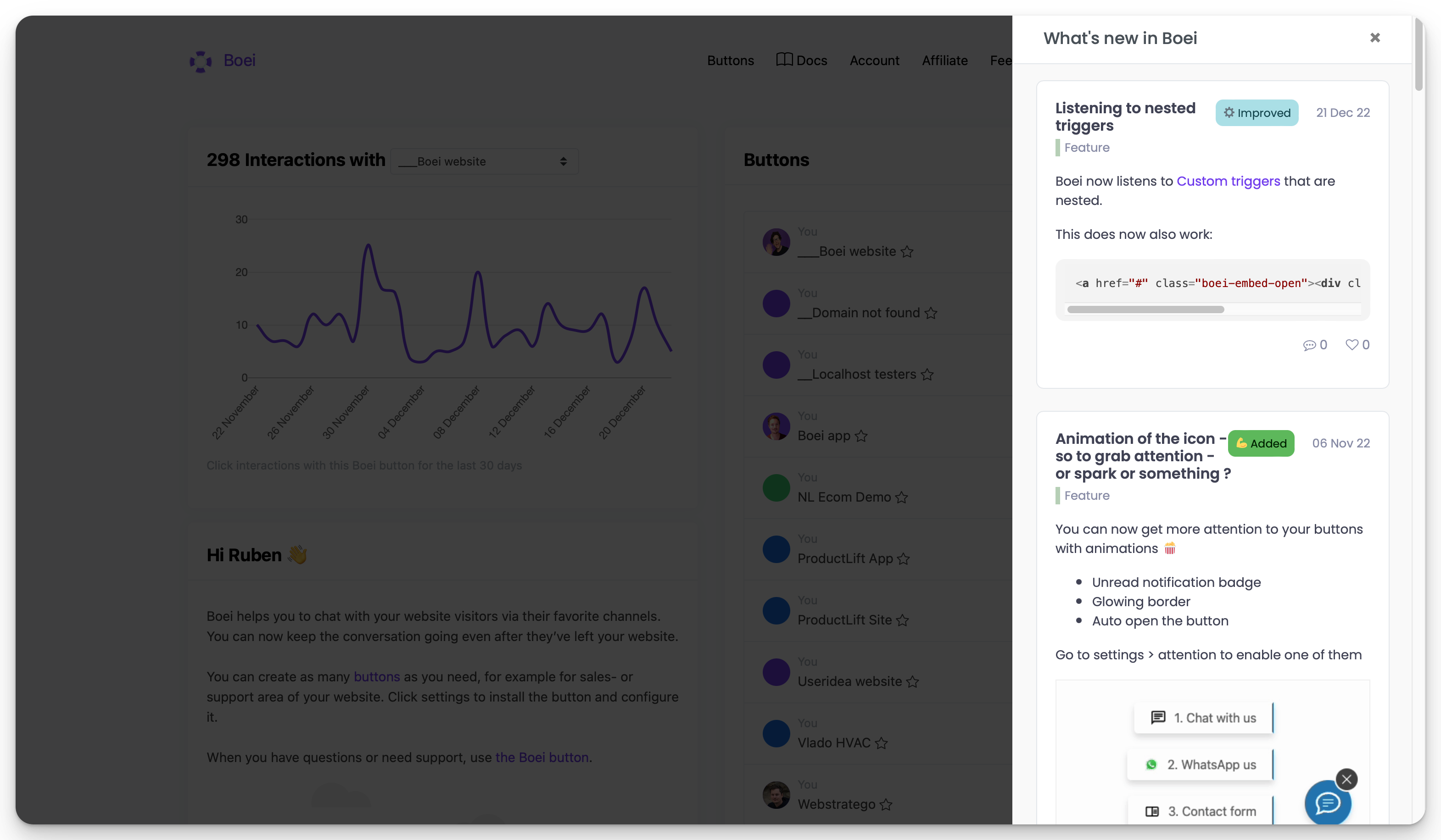
What's New Popup
A compact changelog popup that opens on click. Perfect for showing recent updates without taking up space. Pick What's New Popup from the "More options" section on the Widgets page.
Changelog sidebar
Display your changelog on your website or app on a sidebar that is opened on demand. Pick Board Sidebar from the "More options" section, then select your changelog board.
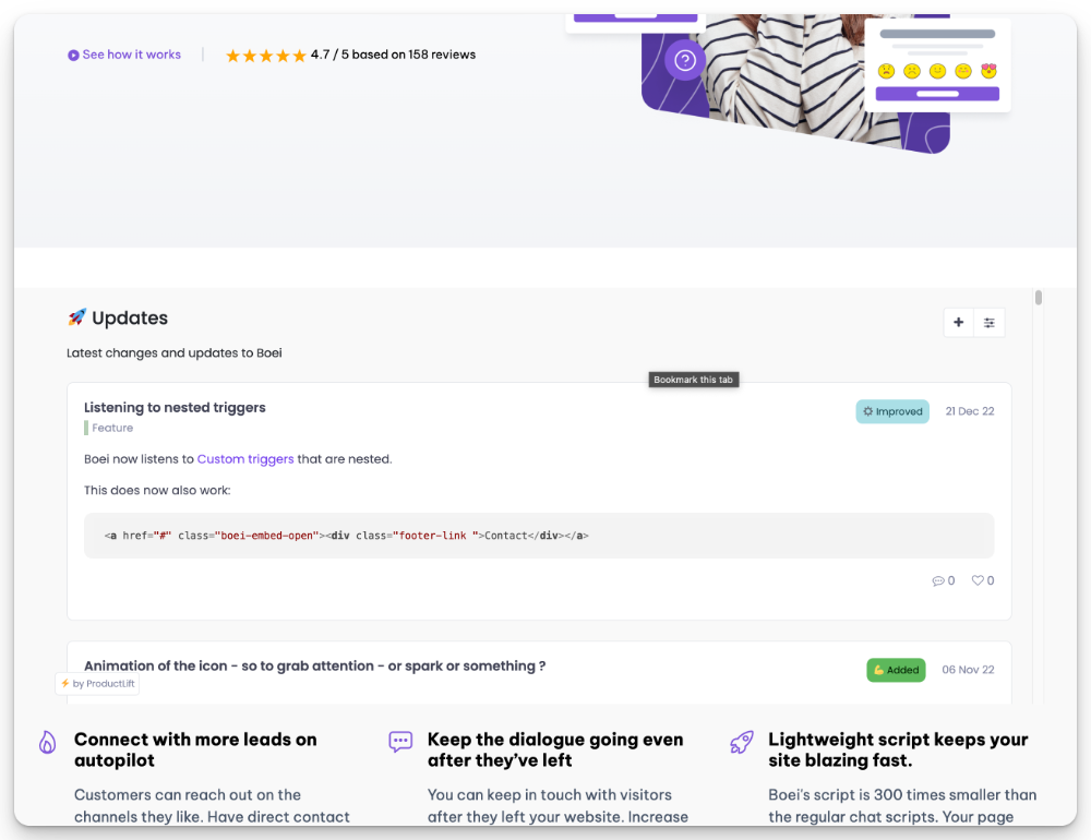
Changelog embed
Display your changelog on a particular page of your website by simply pasting the widget code into the desired area. On the Widgets page, click your changelog board card to instantly create an embed widget for it.
Inline comments and reactions
If you let users react or comment on changelog entries inline, those interactions are gated by the per-board Enable commenting toggle. Open the changelog board's edit page and turn commenting on (or off) under Voting & Comments to control whether the inline reactions show on your changelog widgets.
Unread badge
When you embed a changelog widget on your site, ProductLift can flag the trigger element when there are new posts a logged-in user hasn't seen yet. This is the classic "red dot" pattern: the user notices a badge, opens the changelog, dot disappears.
How it works:
- Your user is logged in via SSO (the SDK identifies them).
- The SDK fetches per-user state and adds a
productlift-has-unreadclass to the trigger element when the changelog tab has at least one post with a status change newer than the last time that user opened the changelog. - When the user opens the changelog, ProductLift records the view timestamp on their profile. On the next page load the badge clears.
The feature is only active for changelog-type tabs. It is not shown for users who have never opened the changelog at all (so first-time visitors don't see a perpetual dot).
Adding the styling
ProductLift does not ship a default style. The Installation tab on a changelog widget shows a copy-able starter snippet. The simplest version:
.productlift-has-unread {
    position: relative;
}
.productlift-has-unread::after {
    content: '';
    position: absolute;
    top: 4px;
    right: 4px;
    width: 8px;
    height: 8px;
    border-radius: 50%;
    background: #e53935;
    box-shadow: 0 0 0 2px #fff;
}
Paste this into your site's stylesheet and adjust positioning, color, and shape to match your brand. Because the class is applied to your trigger element (the link, button, or icon you control), you can scope the style any way you like.
Set up
See the Install Widgets guide for the full installation reference, including per-platform snippets and SSO options.