Customize branding and colors
How to get there: Click Settings in the sidebar → Portal design → Branding.
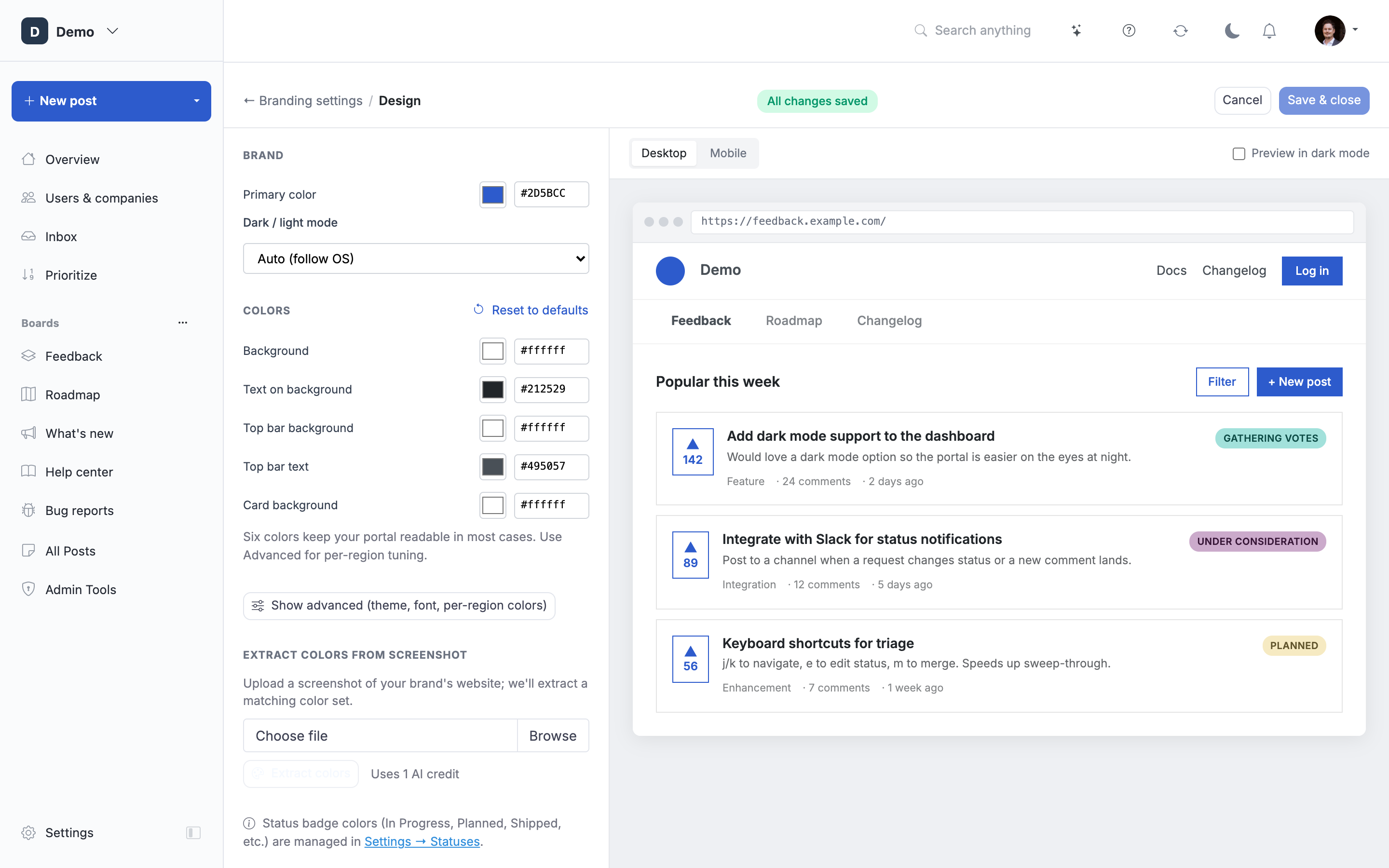
Customize the look and feel of your portal so it matches your brand.
The Branding page shows a compact card with your logo, primary color, and dark/light preference for quick edits. For a full color palette, custom fonts, and a live preview, click Open Branding Designer to launch the fullscreen designer.
Logo and Favicon
Upload your logo and favicon. You can also choose to hide the portal name and show only your logo in the header.
Supported logo formats: PNG, JPG, GIF, SVG, and WebP. WebP gives you the smallest file size, but a few older email clients don't render it, so you'll see a warning when uploading WebP that emails (welcome, digest, notification) may fall back to your portal name instead of the logo. If your logo needs to render in emails, prefer PNG or JPG.
Supported favicon formats: PNG, ICO, SVG, JPG, and WebP (max 2 MB). PNG/JPG/WebP are automatically resized to 32×32; SVG and ICO are stored as-is so browsers can pick the sharpest rendering at each size.
Branding Designer
Click Open Branding Designer on the Branding page to launch a fullscreen editor with a live portal preview on the right. Changes render instantly so you can dial in your palette before saving.
Brand
- Primary color sets buttons, accents, and links across your portal.
- Dark / light mode picks the color scheme (see Dark and Light Mode below).
Colors
Six colors keep your portal readable in most cases:
- Background, the page background behind cards.
- Text on background, body copy and card text.
- Top bar background, header and tab strip.
- Top bar text, navigation links and tab labels.
- Card background, post cards and panels.
Hovering a color row highlights the matching element(s) in the preview so you can see exactly what each control affects. Click Reset to defaults at the top of the Colors section to restore ProductLift's default palette.
Advanced
Click Show advanced if you want per-region control. Advanced exposes:
- A theme preset (Clean, Rounded, or Sharp) that sets card corners, shadows, and button radii.
- A font picker with a curated Google Fonts list, system fonts, or any Google Font name you enter manually.
- The full 10-color palette so you can style navbar, tabs strip, and cards independently.
Click Hide advanced to return to the simplified view. Nothing you set in Advanced is lost, it just returns to the concise set.
Screenshot color extraction
Upload a screenshot of your product or website, and ProductLift extracts a color palette from it and applies it to your portal. This is the fastest way to match your portal to your existing brand colors. Supported formats: PNG, JPG, WebP. Review the extracted colors in the panel and click Save & close when you're happy.
Dark and Light Mode
Switch between a light or dark color scheme. The dark mode theme adjusts backgrounds, cards, and text colors automatically. You can further customize individual colors after choosing a mode.
The Dark / light mode setting has three options:
- Auto, follows the visitor's system or browser preference. Recommended.
- Force Light, always show the light theme.
- Force Dark, always show the dark theme.
Use the Preview in dark mode checkbox in the Branding Designer to see how your palette renders in dark mode without changing the portal's actual setting.
Dark Mode Logo
When dark mode is active your main logo may be invisible against the dark background (typical for dark logos on white). Upload a separate Dark Mode Logo in the Logo section so a different image is shown when a visitor is in dark mode.
- Optional. If you don't upload one, the main logo is shown in dark mode too.
- Only used when Dark / light mode is set to Auto and the visitor's system has dark mode active. With Force Light or Force Dark the main logo is always used.
- Preview is shown against a dark background so you can verify legibility before saving.
- Recommended format: PNG, SVG, or WebP with a transparent background. Max 2 MB.
Custom CSS
Open Settings → Portal design → Branding and expand Advanced to edit Custom CSS. Write CSS or SCSS that is compiled on top of the Bootstrap 4 stylesheet ProductLift uses. This lets you override any Bootstrap variable or add completely custom styles.
See the Custom (S)CSS article for a full list of variables and examples.
Board width
Width is automatic per board: changelogs use 800px, other board indexes and knowledge base topics use 1080px, and roadmaps with more than five columns expand. Articles use their own layout. To override a board, use Board settings → General → Advanced: content width → Public board width. Existing custom portal widths are preserved on the boards during the upgrade. See Manage boards.
Whitelabel
Remove the "Powered by ProductLift" branding from the bottom of pages and emails. This is available on higher-tier plans.